Vulnerability Severity Indicators
why the simple version?
Problem statement
A note
the 40% case study
This case study represents around 40% of the process and work behind this project. If you want to see what a more complete one, check:
I have worked on many more projects throughout my design life and it is luxury to document everything during work with my workload. I could probably spend months turning all of them into detailed case studies.
But I am also a mum, a daughter, a wife, a friend, an artist, and a person who needs time for physical exercise, meditation. I choose not to spend all of that time documenting work I have already done.
But if a particular project makes you curious, ask me about it. I’m very happy to open the design files, show you the details, and talk through the decisions, mistakes, trade-offs, and things that never made it onto this website.
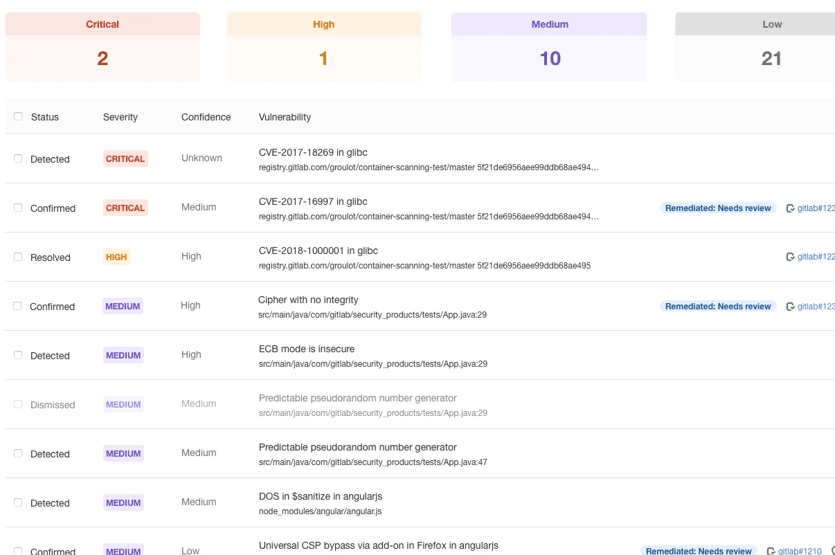
Vulnerability severity is one of the most consequential signals in a security workflow. When it's hard to read, slow to parse, or ambiguous under pressure, teams deprioritise the wrong things — and real risks slip through.
My responsibilities
User research & validation — Conduct problem validation research to identify and prioritise user needs.
Solution design — Design a structured, intuitive framework for policy configuration.
Solution validation — Validate design decisions through usability testing and feedback loops.
Implementation support — Deliver design handover and support engineering with implementation planning.
3 gaps
In the current indicator system
Hard to scan
at speed
Text-only labels slow triage in dense lists, dashboards, and mobile views where decisions happen fast.
Breaks across languages
Severity strings overflow compact layouts in Russian, German, and other languages — a reliability problem for global teams.
Fails accessibility standards.
Color-only differentiation excludes colorblind users — a significant share of the security practitioner audience.
Competitor analysis

The security industry has converged on convention, not best practice. Text-and-color dominates by default, not by design — and no platform has established a visual standard that holds up across languages, contexts, and accessibility requirements. That's the gap this project addresses.
Explorations
Different directions and justifications

Color + general icon + text
Generic icons add visual anchors but lack domain meaning.
Color + text
Most common across competitors. Familiar but limited.

Color + general icon + text
Generic icons add visual anchors but lack domain meaning.
Color + security icon + text
Shield metaphor ties severity directly to security context.

Recommendations
Text-only — and validate with research
After reviewing the broader product direction, the recommendation is to run non-moderated user research across all options before committing to an icon system. A fixed icon set may not keep pace with an evolving, multi-factor scoring model.
Current

Simple update
Future
